extension of a
primary school
clusone (bg)2010
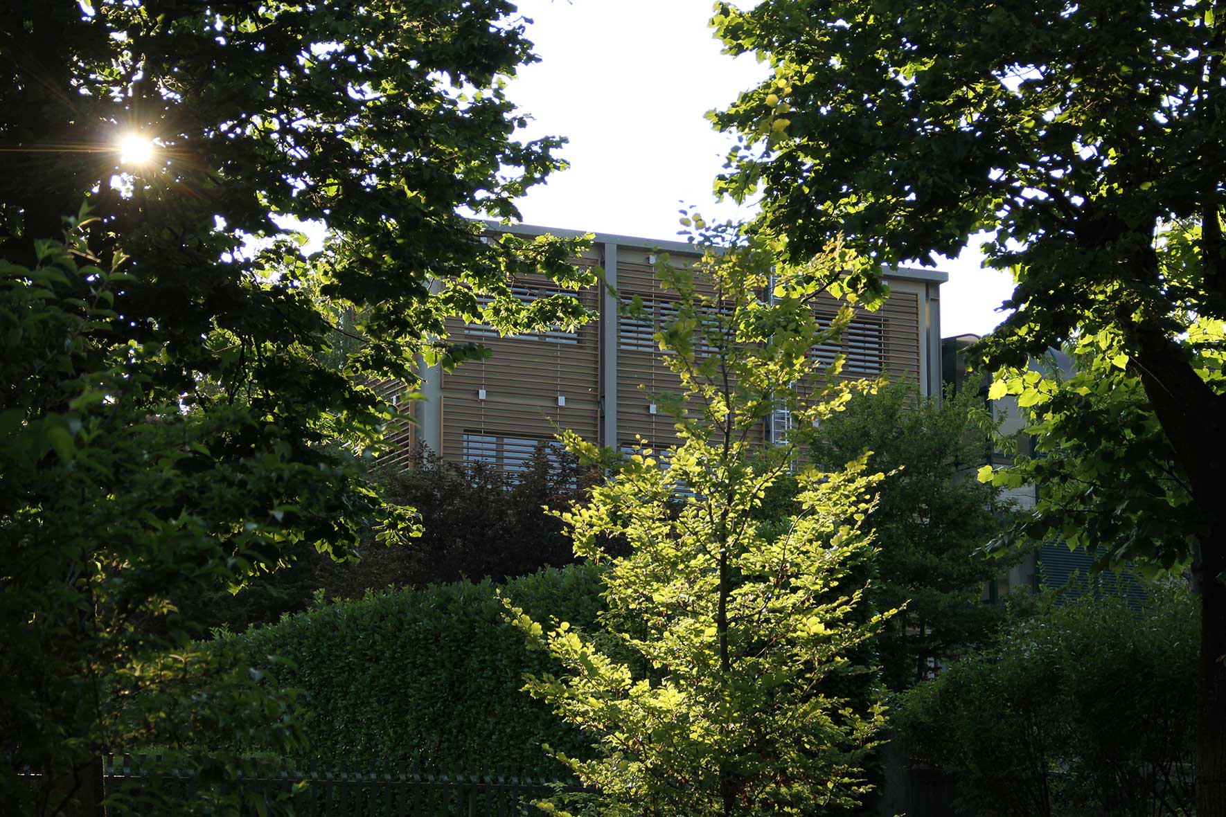
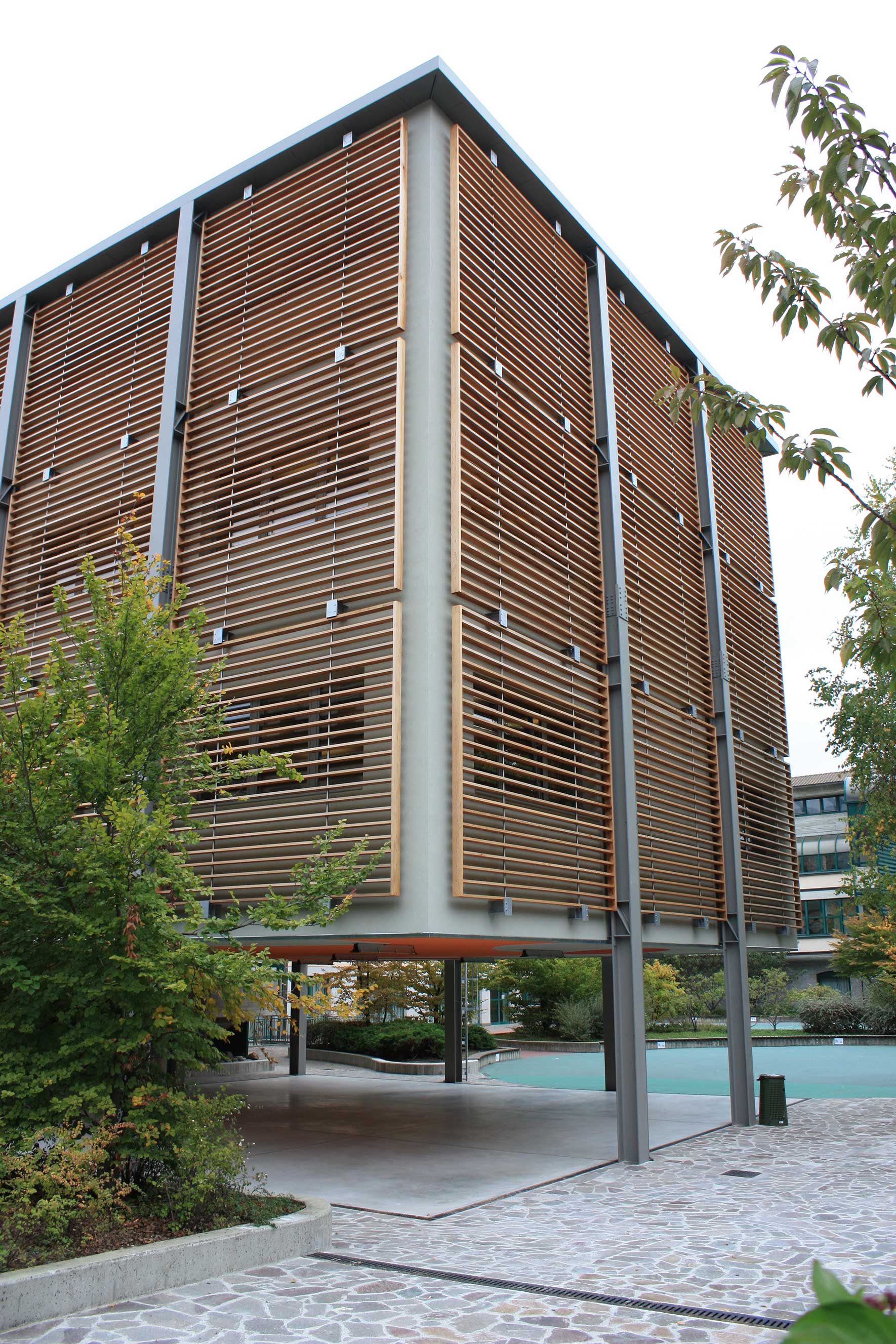
A vertical steel grid box containing the rooms intended for teaching has grown silently like a tree during the school year by applying the “Meccano” construction system to add bolted elements.
- © michele milesi
- © michele milesi
- © michele milesi
- © michele milesi
© michele milesi
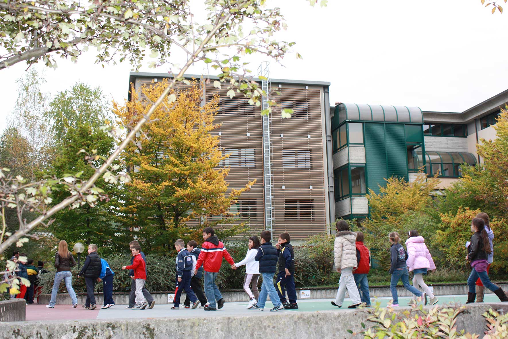
For the second time, after almost 15 years, I found myself working on a project about the same school building that was designed at the beginning of the 1990s by another professional. I have always maintained that the architectural form should not be the objective, but the consequence of a series of reasons deriving from functional and expressive needs.
© michele milesi
For the municipal library, which would be located in the attic of the school, I chose a flashy orange-red entrance with the aim of clearly showing that this area had a different function from the school. When I expanded the school, I had to deal with the same problem from a different point of view. I certainly wanted to show that the extension had the same function as the main part of the building, but I wanted to use a language that I thought was more suitable and contemporary, both as regards internal comfort and construction technology.
© michele milesi
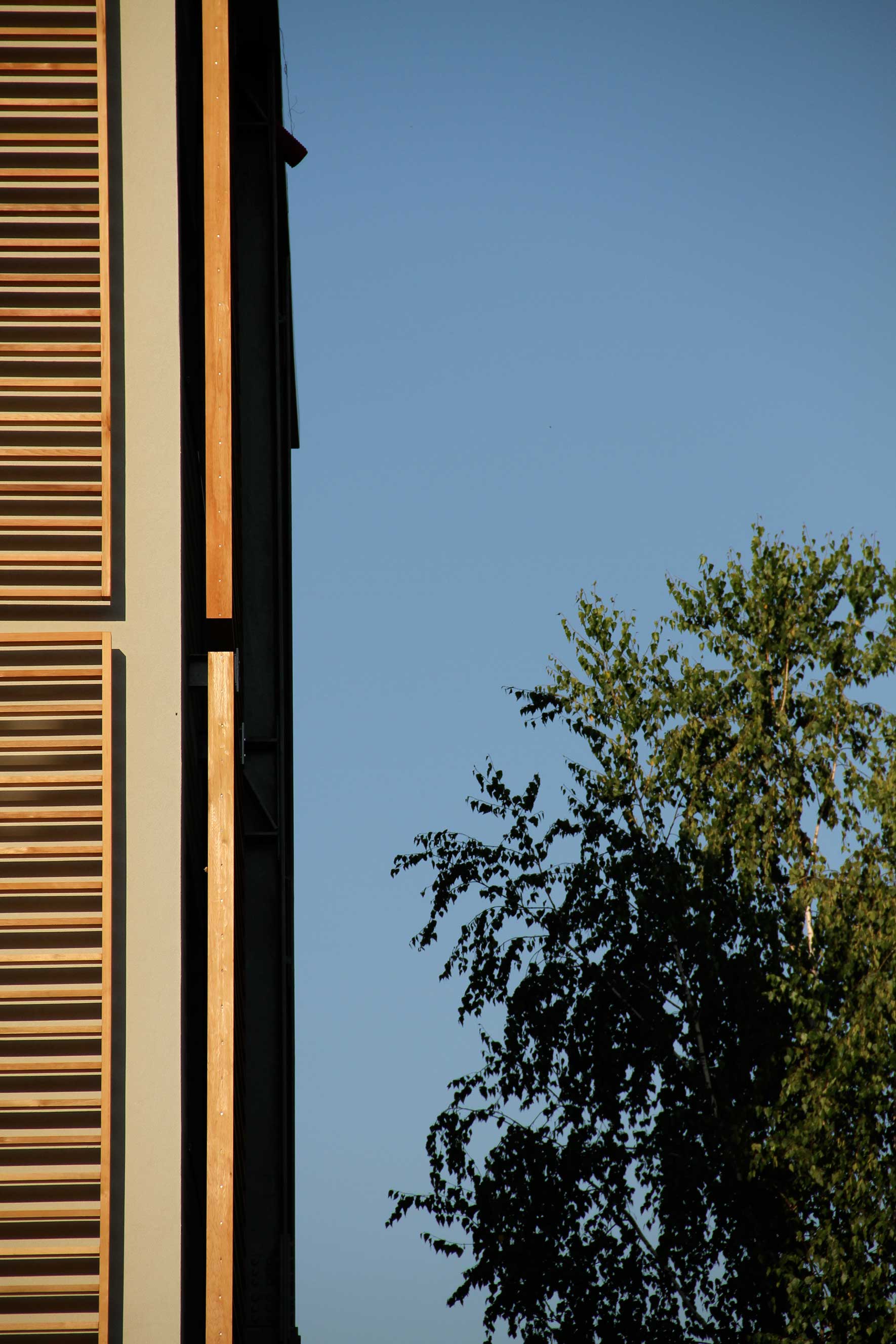
For this reason, I decided that the extension would clearly appear as an addition and should therefore have been detached from the existing building. The new building had a different shape and was made of different materials only for functional reasons, while the decoration was provided only by the particular construction and technological details.
© michele milesi
